
Whimsical

Hi, I’m Tanguy and I write about successful feature launches from the best product teams ⚡️. This week’s post is about Docs, Whimsical’s latest baby. This release feels special because it leverages the best of Whimsical and combines it with a delightful new text editor. I needed to know the backstory so I reached out to co-founder Steve Schoeffel for an interview. Read on!


New here? Subscribe to get the next editions 💌
How Whimsical built Docs

An unexpected journey
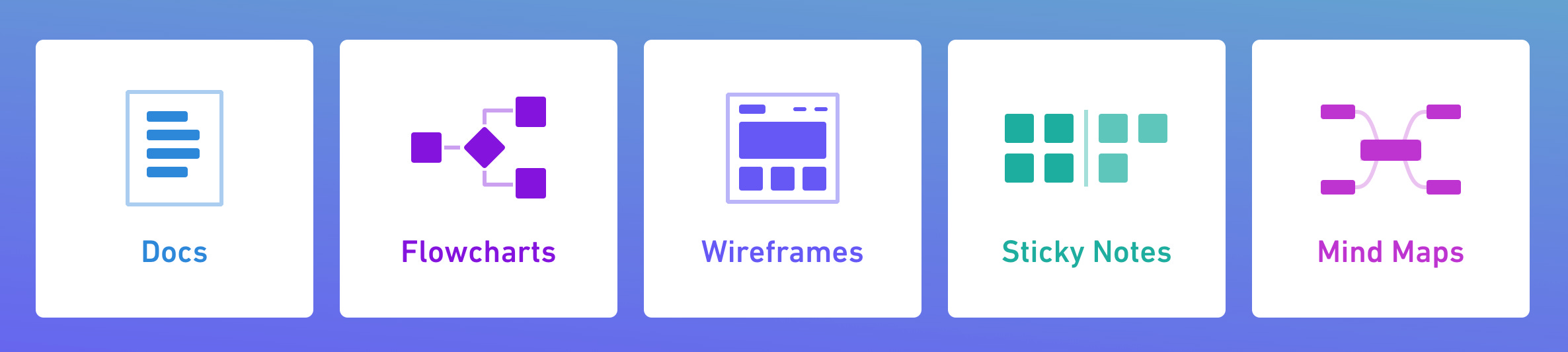
We publicly launched about three years ago and since then we released a succession of products. Docs is our fifth product and it is unique for several reasons. All of our other products are board-based, they feel like digital whiteboards. First we released Flowcharts. Then Wireframes. Then Sticky Notes. Then Mind Maps. From the very moment we launched our app we had flowcharts available and we had “coming soon” on each of the others.
So we had laid out those first four from the very beginning. And then we systematically just launched them every four months or so. Docs was unique because it was the first one that we hadn't planned out. We didn't know exactly what was going to happen after releasing Mind Maps.
Dog food
For us product decisions like this one really come down to building for ourselves. We're big proponents and believers in building for ourselves as much as we can. It gives us powerful insights. We use Whimsical as a team all the time. We're in there day in, day out. So we’re responding to our own needs and we understood that Docs would benefit our users as well.
We got to an interesting point where all of our communication was in these Whimsical boards, with a very visual, non-linear type of thinking. Which is great! I think it's a vital component of communication. And it’s a missing piece in a lot of text documents.
But you still need text documents to communicate and to think through things. And we were using some other tools for that. We were using Dropbox Paper at one point, and then we switched to Notion, and they were great, but we couldn’t stop thinking “Imagine if we had this in Whimsical with a combined experience. There would be one place to search, one place to write your thoughts in a linear format, and then you’d switch to a board where you could break out of that and then jump in and out of the two.”
And there it was. We had that realization that the one thing we needed the most was text documents. That's when we started working on Docs.
Crafting
Docs is the product that we've worked the longest on. By far. And the reason for this is that there was a lot of technical infrastructure to put in place. Early on we faced the question: “Do we want to build our own editor?” Essentially where we landed was “Let's see if we can build this thing from scratch, because if we can pull it off, then it's going to have a lot of downstream benefits. We’ll have more control over the product experience.”
Doing it opened up new possibilities. It also removed some of the bugs. We had been previously using a library that was managed by someone else and we would have these bugs with accented characters from different languages and other little things that we couldn't quite control.
With Docs we went all in. It’s the way we like to do things. We take a craftsmanship approach and care really deeply about our product.
It’s in the details. We work as much as we can to make the experience fluid, intuitive, and beautiful.
Use cases
We've been using Docs full-time for at least five months. We switched over to it internally as soon as it was stable enough to support our workflow. There are many use cases. I'm actually amazed at the amount of use cases it opens up for the product and for our team.
The one I love the most is the product spec.
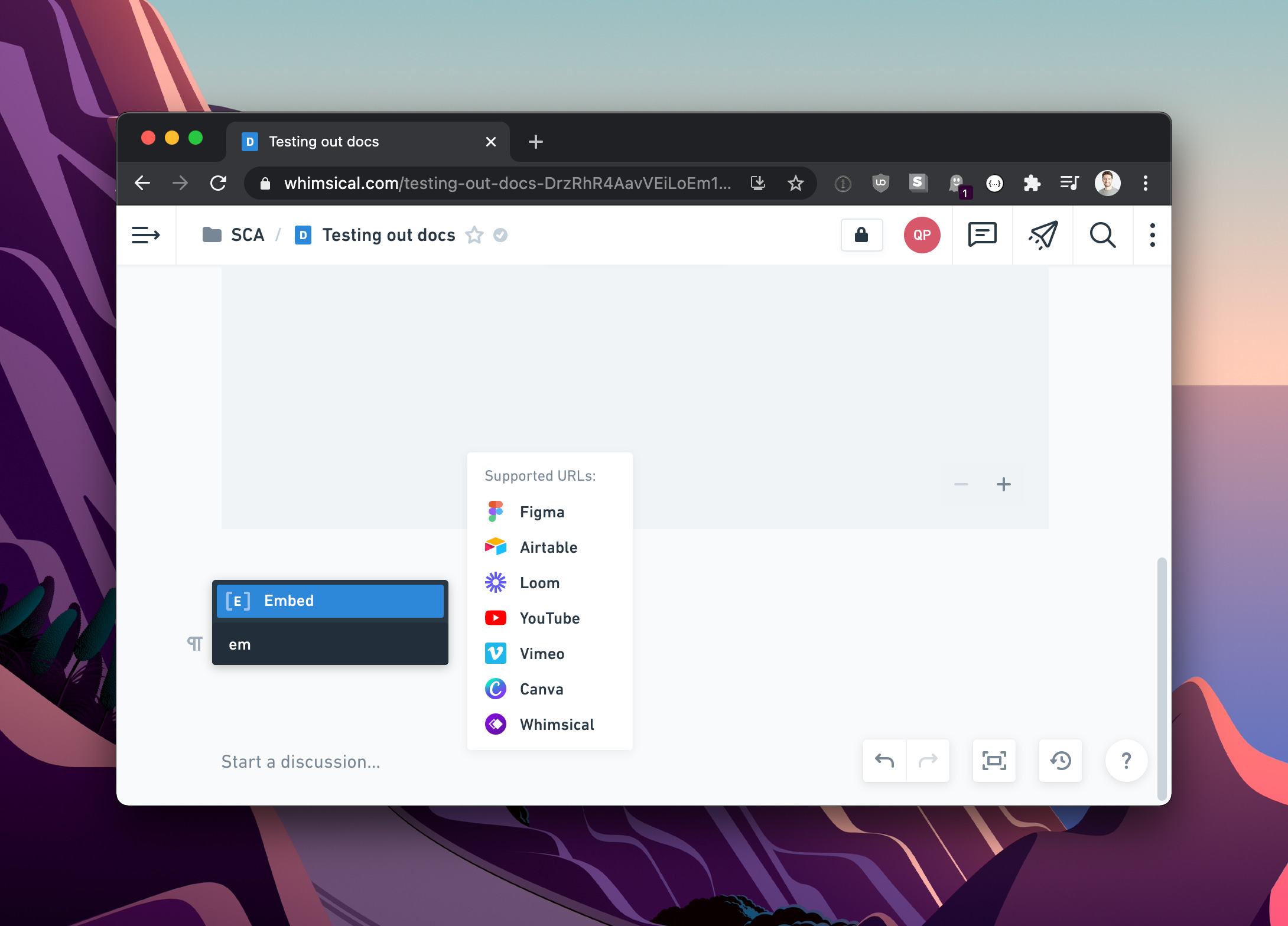
It’s really tailored for it. You can write down a couple thoughts, spin up a wireframe and then jump right back out to the doc and keep going. You can do everything on that board. And it just feels really fluid. We have integrations with some key apps, like Figma, where we do our high fidelity work. And you can bring those into the doc.
Another important use case is organizing our team information. Like a team wiki. We just released custom icons for folders and files. You can change the color and the icon type for that. It works really well for wikis where you're organizing based on these different categories.
There's probably a dozen legitimate use cases that Docs support in a significant way. And it’s interesting because they’re such mainstream use cases that plenty of other tools do similar things. But we really focused on integrating it with our existing board-based products. That became our primary differentiator. The integration is really tight and seamless. Beyond that, we just wanted a great editor experience, and really solid collaboration.
Keeping it simple
Keeping the product simple is one of the things we felt was important. And then we heard users vocalize this as well. They said “Thank you for limiting our options.”
It's counterintuitive in some regards. You’d think giving them all the options would make everyone happy. I think people actually thrive off of the constraints because it reduces their cognitive load. It allows you to be more focused on thinking than on styling. We've been glad to see that others have appreciated a little bit more of a constrained approach to product. Like anything else it's a balancing act and one that we are actively thinking about and managing as we go along.
Measuring success
The way that we think about it is: we want to build really high quality products. The qualitative feedback is really important to us.
We take a lot of pride and enjoy it when people mention us on Twitter and say things like “Wow, this is such an amazing experience” or “It gets out of the way and lets me think!” That's exactly the type of confirmation we strive for.
Other than that we want people to be using our tool on a regular basis. We think about them as monthly active creators. So that could be used as a success metric. However it's not something that we're optimizing for. We're not trying to really inspect every detail in that number. It's a lagging indicator that measures whether Whimsical is a valuable tool. I think that's a helpful North Star. It generally tells us that we're on the right track.
Who do you build for?
Fundamentally we try to think about jobs to be done. We answer questions like “What's the job here?” and “How can we fulfill it the best we can?”.
Beyond that, our users tend to break down into two large groups: tech companies and digital agencies. Sometimes it’s helpful to think about this, since digital agencies might have specific needs for instance. But in general we like to reduce it down to jobs to be done. And we’re still learning exactly what that means and how we can apply that in better ways.
What’s next?
We have adopted a modified version of Basecamp’s Shape Up for project management. Basecamp has been inspirational in some important ways for us.
One concept we’ve espoused as a company is the idea of not really having a roadmap and just planning the short-term.
Sure, we think about the long-term and we want our trajectory to follow a coherent and strategic path, but really we're trying to limit our planning to the next cycle, which lasts six weeks. This helps us be as responsive as we can to the most important things that we need to be focused on.
Thanks Steve!
Learn more about Whimsical
Team
Whimsical was built by an eleven people team. How fantastic is that? They’re remote first (and were before the pandemic). Their most recent hire lives in Scotland. Others are based in Colorado and Latvia 🌎️.
Should I use it?
Ahmad Kadhim makes a good case that your design team should use only Notion, Whimsical and Figma.
Bootstrapping
Did you know Whimsical was bootstrapped? Its CEO Kaspars wrote a post that explains why.
Nailing product marketing
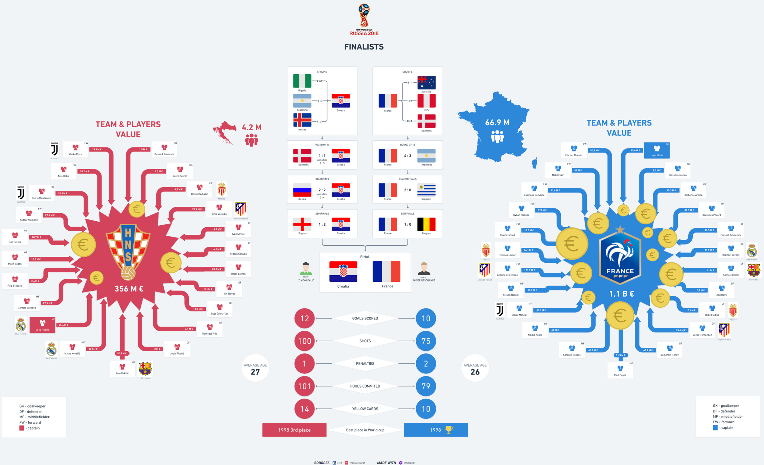
Back in 2018 the Whimsical team made a wonderful flowchart that compared France and Croatia ahead of the World Cup final. Check it out! This is product marketing playbook material⚡️
Thanks for reading!
Tanguy
Subscribe and get the next editions 💌